
If you have a successful and popular day spa or wellness enterprise, chances are you already have a website you’ve honed and crafted over the years, with the help of whatever tools and themes were the most popular at the time you launched, and, aesthetically represents your vision.
Your website is your calling card, part of your identity, it works well because your guests can read your blog posts, book appointments, buy products and gift cards — and you love it. Maybe because it’s perfect as is, or maybe because although it’s a tad dated, “it just works, we rank for most of our terms and our local business, and we don’t want to fix what isn’t broken.”
Great! That means you and your team have implemented what was once a good design with SEO techniques to assure its compliance with best practices. It has been humming along and other than seasonal or holiday updates, you don’t need to get into the engineering of the site very often.
Until now.
SEO-Pocalypse or Mobilegeddon
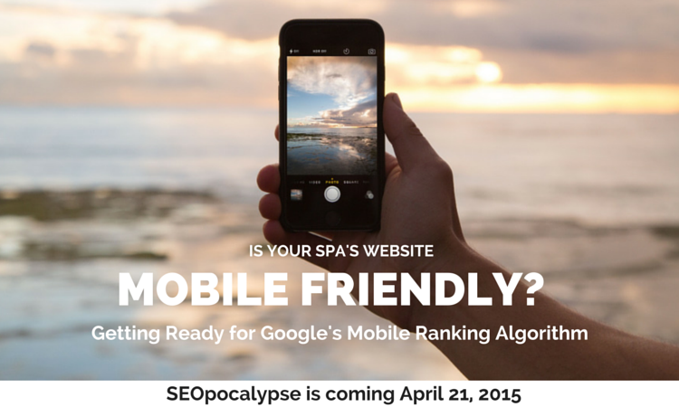
On April 21, 2015 the search engine world is shifting again.
Google has openly and unequivocally stated:
“Starting April 21, we will be expanding our use of mobile-friendliness as a ranking signal. This change will affect mobile searches in all languages worldwide and will have a significant impact in our search results. Consequently, users will find it easier to get relevant, high quality search results that are optimized for their devices.”
What does this mean, and why is this so important?
First, you need to have to have a responsive and mobile-friendly website or you’ll likely see a significant drop in your placement in search engine returns. You’ve seen those terms dozens of times. Do you know what they actually mean?
“Responsive” means your website, and each of its pages and posts, automatically resizes for the user no matter what type of device they are using to visit — a desktop, smart phone, or tablet. “Mobile-Friendly” means that once they get there, they can easily read the data and click links and targets on their devices.
Even if your site design is responsive, it may be so small or difficult to read, it isn’t mobile-friendly as well.
More than 50% of all local internet searches are done via a mobile device — a smart phone, tablet, or laptop. Since customers searching Day Spas and Medical Spas are inherently local, it already negatively impact your profits if you don’t have a mobile friendly website. Now it will affect your visibility, as well.
Second, this is the first time Google has clearly and succinctly told everyone with a business enterprise online — ahead of time — that a new metric is coming.
In the past, some of our members with previously popular websites have asked us “what happened, where did our rankings go?” only to learn about Google’s Panda, Penguin, and Hummingbird campaigns — after the fact.
Now, Google is telling you, decently far in advance in fact, that its new metric (search engine engineering) will be heavily relying on mobile-friendliness as a ranking signal.
What should you do?
If you are website is already responsive and mobile-friendly you have nothing to worry about. Unfortunately, many spa websites are not. Bear in mind a responsive theme isn’t always fully mobile-friendly. Responsive themes adjust most, if not all of the content for smaller displays, but mobile-friendly themes extend that functionality through navigation menus and so-called “tap targets.”
Responsive and Mobile-Friendly can depend on both the platform you used to create the website, if you have used other than a custom theme, whether it’s current, and whether it extends to both display and function.
Let’s take WordPress for example. There are literally thousands of themes, both free and premium, available. But if you sort them by those tagged “responsive” that number drops by more than half. Just because the WordPress platform let’s you use responsive themes, doesn’t mean you have one, or, that it’s fully mobile-friendly.
Here are the three things you need to do by April 21:
- The easiest way to comply with the new metric is assure your existing website is responsive and mobile-friendly. Your content should adapt to present a consistent user experience across all display sizes, the navigation should work, and the tap-targets should work. If you’re using a theme which has a responsive option, but you’re using a non-responsive theme, make the switch as soon as possible.
- You also have the option of creating a separate mirrored Mobile Site, but this option has a few issues. You have to be certain any content on your static site is consistently matched on the mobile site. This can be a time sucker if not done correctly.
- Any changes you make to your website to assure it is mobile-friendly need to be submitted to Google for a fresh crawl. Your webmaster should have a Google Webmasters account which permits you to request that Google to crawl and fetch content on your site — particularly new or changed content. Be sure to fetch your updated website and all links using a “Mobile” setting.
We are so glad that Google announced this policy shift because it has enabled us to spend a few weeks alerting our own roster of spa industry clients to make the switch.
Fortunately, Spa Index provides a responsive and mobile-friendly global spa directory, and every one of our full-page directory listings for our clients has always been compliant with this best-practice. This means our clients’ directory listings display search-engine ready contact information, social media links, photo galleries and text overviews which are mobile- friendly. For our full-service members, the websites we have prepared and published for them are also mobile-friendly.
We’re good to go, but the open communication by Google means you’ve got time to make sure your website is good to go, as well.
If you have any questions, or need an evaluation or maintenance of your current website, our team of experienced website design and SEO experts are here to help provide some shelter from mobilegeddon.